I spent some time in the last months playing around with various color schema and finally decided that the original port of the Vibrant Ink schema to VS is still the one that most appeal to my eyes. The one made by Rob Conery is a bit too little contrasted for me.
So here is my VS2008 with the latest version of Vibrant Ink for VS2008 made by John "DLR" Lam.
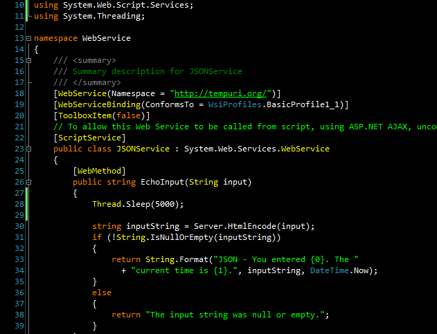
Here you can download it. Just remember that this vssetting file include also the other personalization of John, so just import the "Options>Environment>Fonts and Colors" branch of the settings.
I use a very similar color scheme but all the colors are made pastel and the background is a very dark gray because I suffer from the worst migraines and that is one way to have a lot less of them.I notice a significant difference when i have to be in word all day for example.. then the warning signs start popping up very quickly.
I had a few of them when using the white background, and this black one made them disappear. So cannot complain about that... at least for the moment
Funny - people always give me crap because I use a color scheme very similar to that (almost exactly). They always tell me it looks like I'm coding in TurboPascal. I tell them - I AM - TurboPascal.NET!
They tell me I'm developing in COBOL :)
about
This is the blog of Simone Chiaretta, an Italian .NET developer, architect, Subtext core member and with a passion for mountain climbing. Want to know more? Keep reading...
Ads by The Lounge
Subscribe
Tag Cloud
Popular Posts
Archives
Post Categories
.NET Blogs
Friends
NZ .NET
Subtext devs
Vista Gadgets
Recent Comments
Site Links